I’ve been doing a lot of event photography lately, mostly in low light.
I’m happy to help out some local organisations with free images. Usually there is a usage agreement, but I seldom take the time to look at how they have been reproduced in a newspaper or whatever.
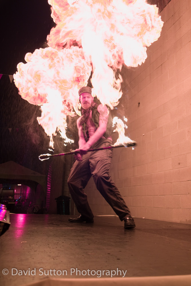
Last week I discovered one of the images from last year’s Fire & Steam festival in Oamaru had appeared in the Otago Daily Times and caused some comment. You can one such article here.
I thought it may be useful to explain how it was made.
Mostly I will start with a few photographs from different viewpoints, including as high as possible and also ground level. Then I’ll look at where all the other photographers are located and seek somewhere else to stand.
If I were talking about this at a camera club, that would basically be it. Nothing else is as important in my opinion. For the nerdy stuff read on.
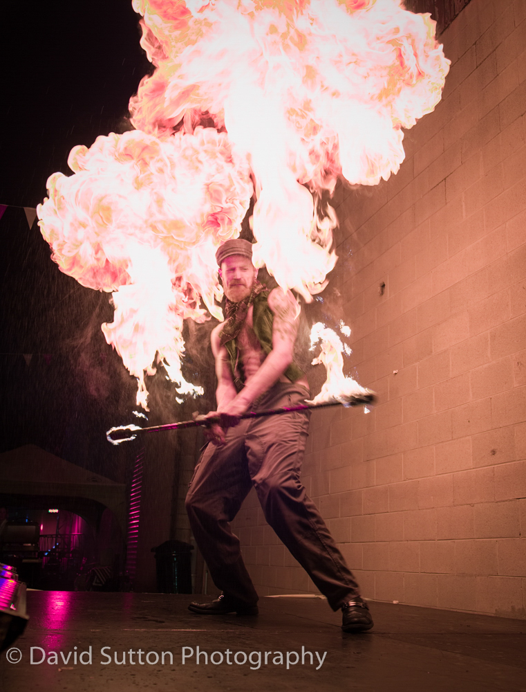
In looking for somewhere else to stand, thus it happened that I was at the side of the stage when the performer let loose with the balls of flame. The camera was set up for low light, but with less than a second to take the photo, you have to go with what you’ve got.
Here’s the relevant shoot data:
Camera: Fujifilm X-T2, 1/60th sec at f/4 and iso 640
Lens: XF 18-55mm kit lens at 21.4mm
Not at all ideal, but probably enough to use.
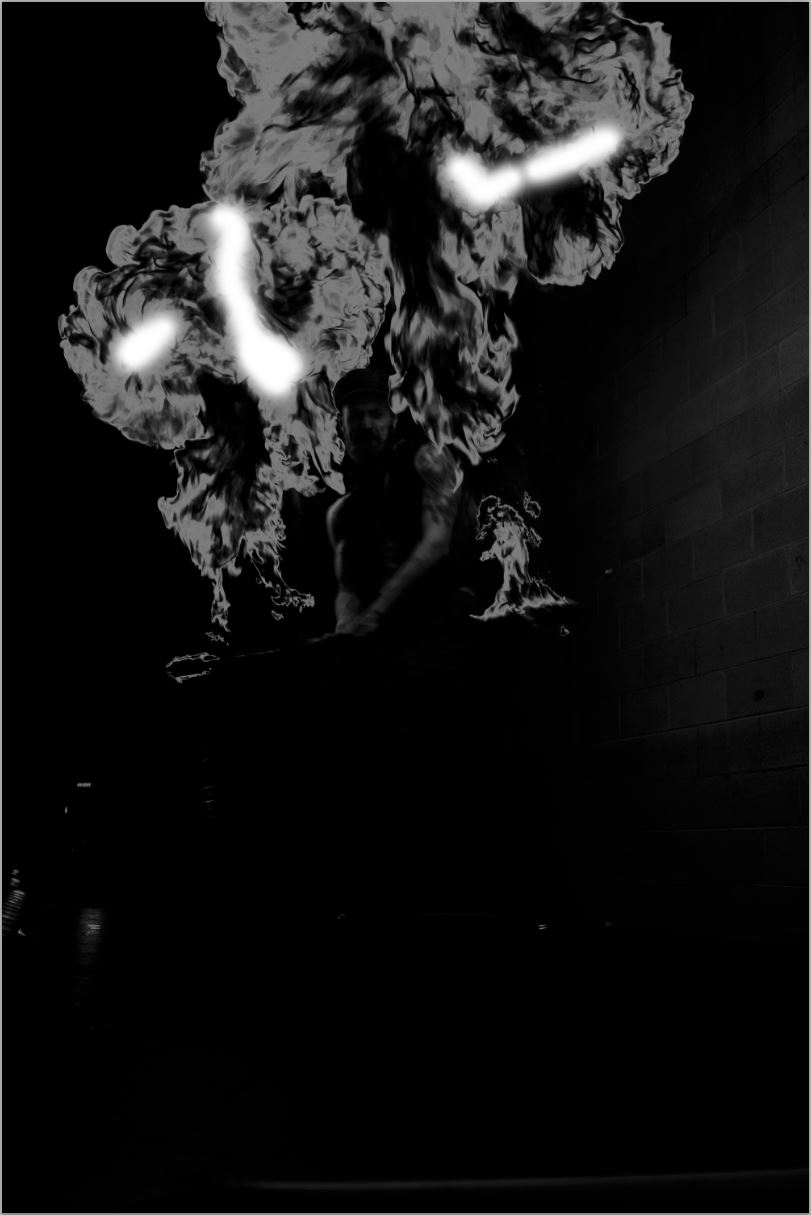
Here’s how it looked in the raw converter (click on the image to open):
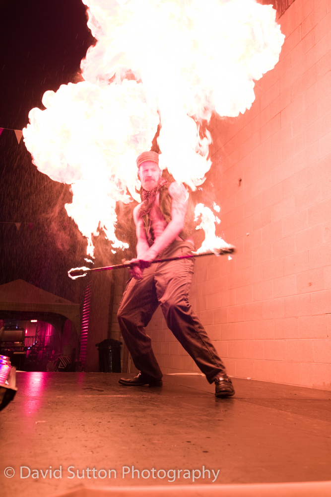
There’s motion blur. I don’t think that matters, I could reduce it by cloning but the background wall is sharp enough and the motion blur adds context and energy. There’s a lot of clipping in the highlights. Again, I don’t think that matters for the photo’s intended use, provided I can recover some detail.
Plus with 16 images to send out I can’t spend more than 10 or 15 minutes on each.
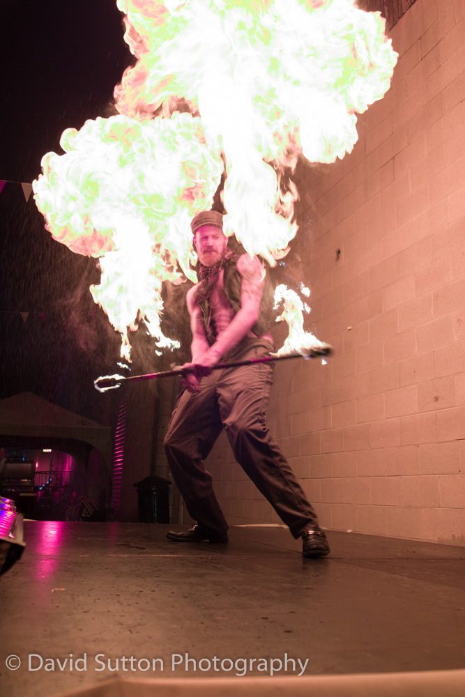
The photo was imported into Lightroom but Lightroom’s raw conversion is poor for Fujifilm cameras, so file made a round trip to Iridient X-Transformer and came back as a dng (this year I switched to Capture 1, which solves that problem).
Here’s the result:
 And here’s the settings:
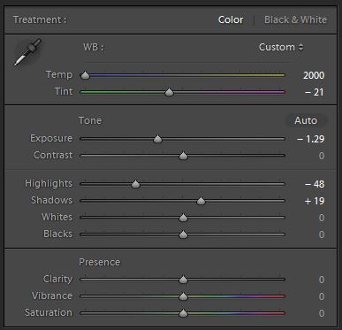 It will need cropping, but that comes last. Now it’s sent to a photo editor, and normally I would colour correct it, but the lighting was quite strange and I want to keep that. What does draw my eye too much is the green in the flame. Is it the lighting or the accelerant? Probably both. I don’t recall seeing it, but more importantly I think it would end up a talking point when I want the photo to be about the performer. So I going to remove it. You may do things differently.
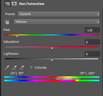
First a hue shift in the yellows applied to the flame:
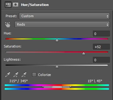
 Next a saturation increase in the reds applied to the highlights in the flame:
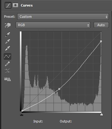
 Finally a curves adjustment on the flame:
 These adjustments are grouped and then masked::
 A little rough and ready, But there’s no time left to spend on this part.
Here’s were we’re at:
 I would like to correct the performer’s skin tone somewhat. It looks much too red. To me the photo is about the performer. I’m happy for the background lighting to stay red, but I’d like him to look a little more natural.
Here’s where it gets tricky.
I correct skin tones by numbers. You may find an easier way. I used the Colour Sampler Tool to place a 5×5 pixel sample point on a part of the skin with a diffuse highlight. I set the readout in the info palette to CMYK. For Caucasian skin, yellow should be a fraction higher than magenta, and cyan should be a third to a fifth of magenta.
To adjust to skin colour with curves, reducing the red channel increases cyan, reducing green increases magenta and reducing blue increases yellow.
Here’s how I remember it: More red, less cyan, less red more cyan. Similarly for green/magenta and blue/yellow.
Here’s the read out from the colour sampler:
Cyan 0%
Magenta 51%
Yellow 15%
Those figures reflect the difficult lighting and will make it hard to correct the skin tone. To make it easier I created a blue filter over the image, and then adjusted the RGB channels in curves, giving me these readings on the colour sampler:
Cyan 9%
Magenta 41%
Yellow 45%
Good enough. I grouped the skin adjustments, masked off everything but the skin, and dropped the opacity of the group to 45% to make it blend in with the overall lighting. The last step in the photo editor was gentle sharpening, which isn’t really visible on the web. Then a non-destructive crop in Lightroom and conversion to a jpeg for sending to the client. The final result is the opening image above