…and Learning to see in Black and White
Often colour can get in the way of the image content we want to show. By converting the photograph to black and white our work becomes more abstract. We can then make changes in luminosity without the viewer making a comparison to the original. So skin tones or landscape elements can be lightened or darkened in ways that would look odd if the image was in colour.
We are very sensitive to changes in luminosity, so working in black and white can help us develop our sense of the subtle and our own vision.
By the way, since most black and white is all about the grey tones, a better and more accurate term is “greyscale”.
Conversion Software
There is Silver FX, Topaz B&W, and the presets in LR, On 1, Capture One and all the others. I sometimes use them when I don’t know where I’m going, or when I’m in a hurry. But here’s what I have to say about converting to B&W:
There’s no “magic button”
Here is the conversion technique I recommend. Most programs will have panels like these:
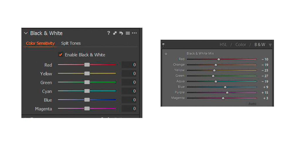
Move the sliders and the underlying colours become dark or light. Pastel shades will not render as pure white or pure black, but anything more saturated than pastels will do so.
Let’s take this example:

The underlying colours can be lightened right up to white:

or darkened all the way down to black.

This is also a good example of why you shouldn’t just desaturate a photo to turn it into B&W. Here’s what happens with this image:

So much for having contrast.
Using Capture 1 or Lightroom or Photoshop I set the underlying colour contrast to give me the basic look I want in a black and white image. Sometimes I need several versions stacked, with what I don’t want masked off. For instance, I may want a blue sky darkened, but a blue building in the foreground lightened.
Then I go to work with curves to lighten or darken in order to direct the eye.
Learning to see in black and white
I often get asked how to do this.
In the days of film photographers spent a lot of time training their eye to see in black and white, but that time has gone.
Remember in black and white it’s the grey tones that are interesting, and so most black and white is is all about the underlying colour contrast.
Because most B&W is about colour contrast, and in the digital age you can make any colour light or dark, you can’t learn to see in B&W.
Here’s what I’d suggest you do to help your B&W conversions.
Study and know the subject you are photographing. Look at examples of black and white photography and develop a vocabulary to describe what you are seeing.
For example, where do most of the tones lie? In the mid-tones, shadows or highlights? What about contrast? What gives it emotional impact?
If you have a mirrorless camera, you can set the viewfinder to black and white. Sometimes that’s enough to give a guide on how an image will look. If you are saving the photos as raw+jpeg you will have the black and white jpeg to remind you what moved you to press the shutter, and the raw file to work with should the jpeg prove insufficient.